 >
>
Best Brand Design
Best Branded Content Design
Youchen Design& The Second Affiliated Hospital of Guizhou University of Traditional Chinese Medicine
China
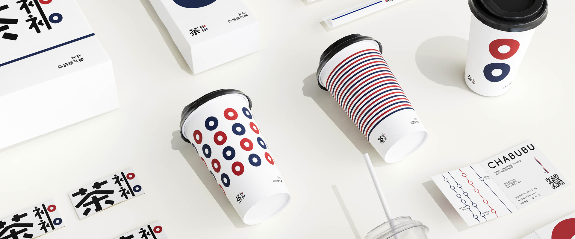
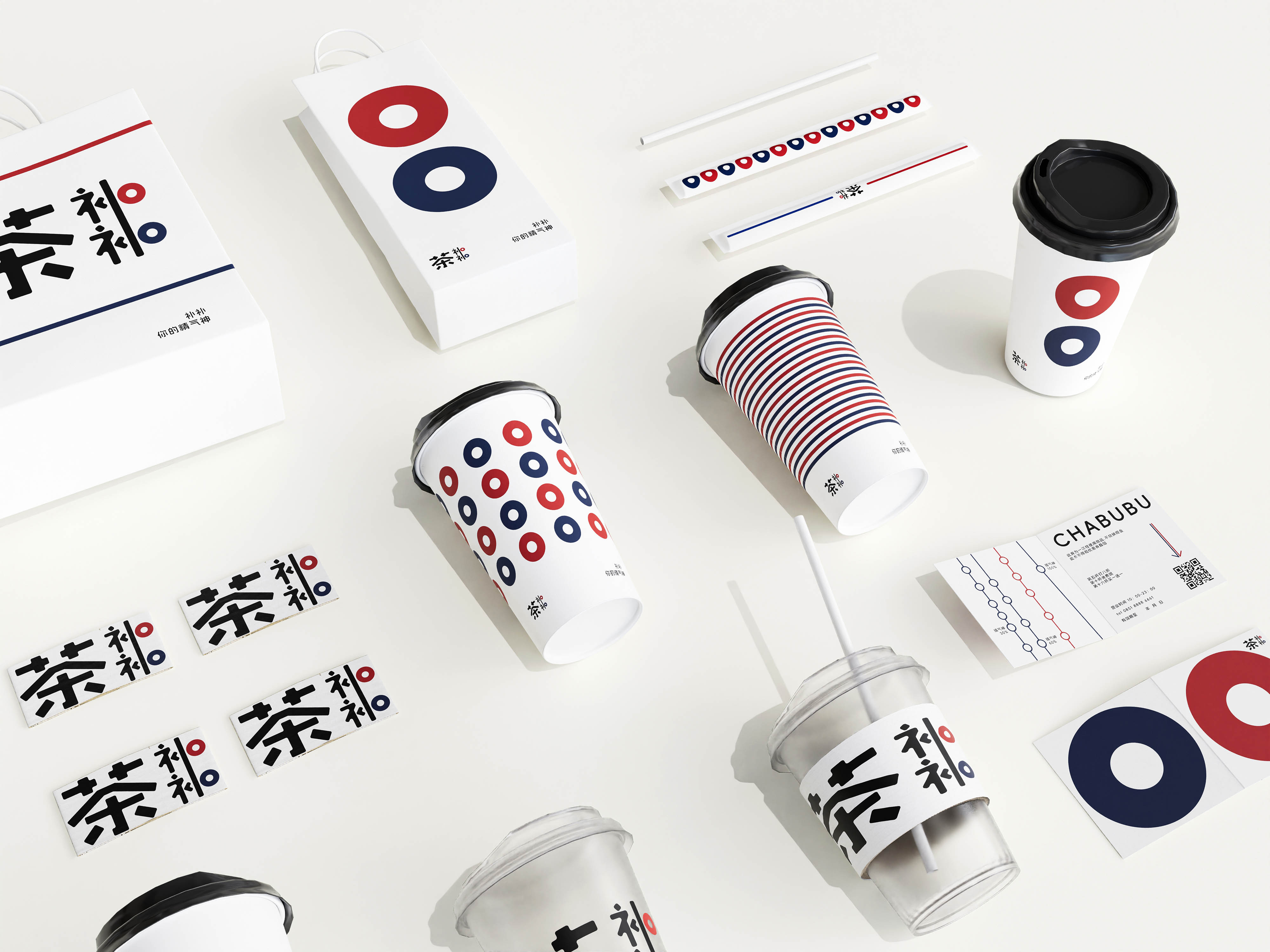
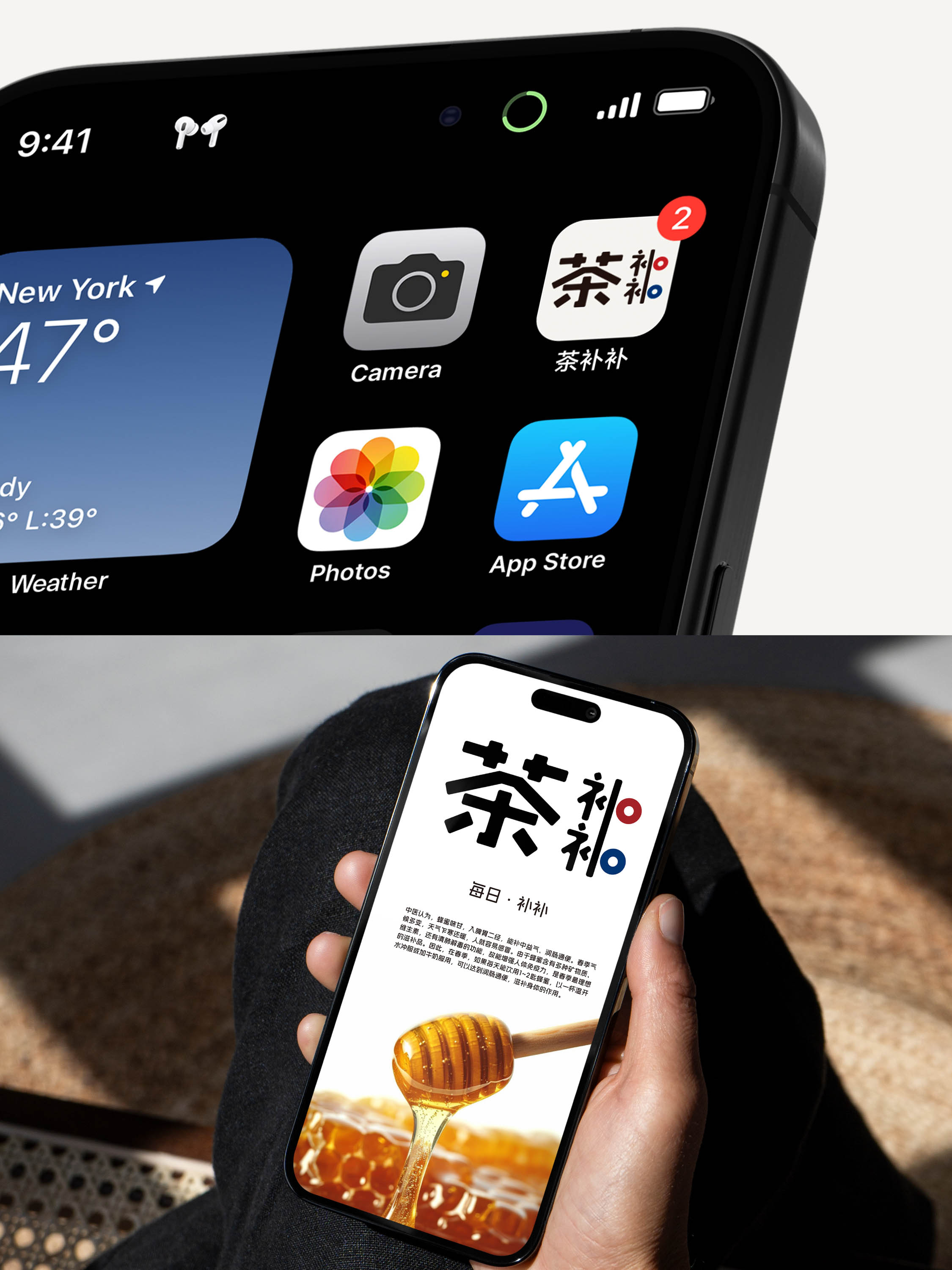
Cha Bubu: TCM Wellness Tea Brand Design
Entrant
Youchen Design& The Second Affiliated Hospital of Guizhou University of Traditional Chinese Medicine
Category
Best Brand Design - Best Branded Content Design
Area / Locality
China
Featured Platforms
Gallery
About
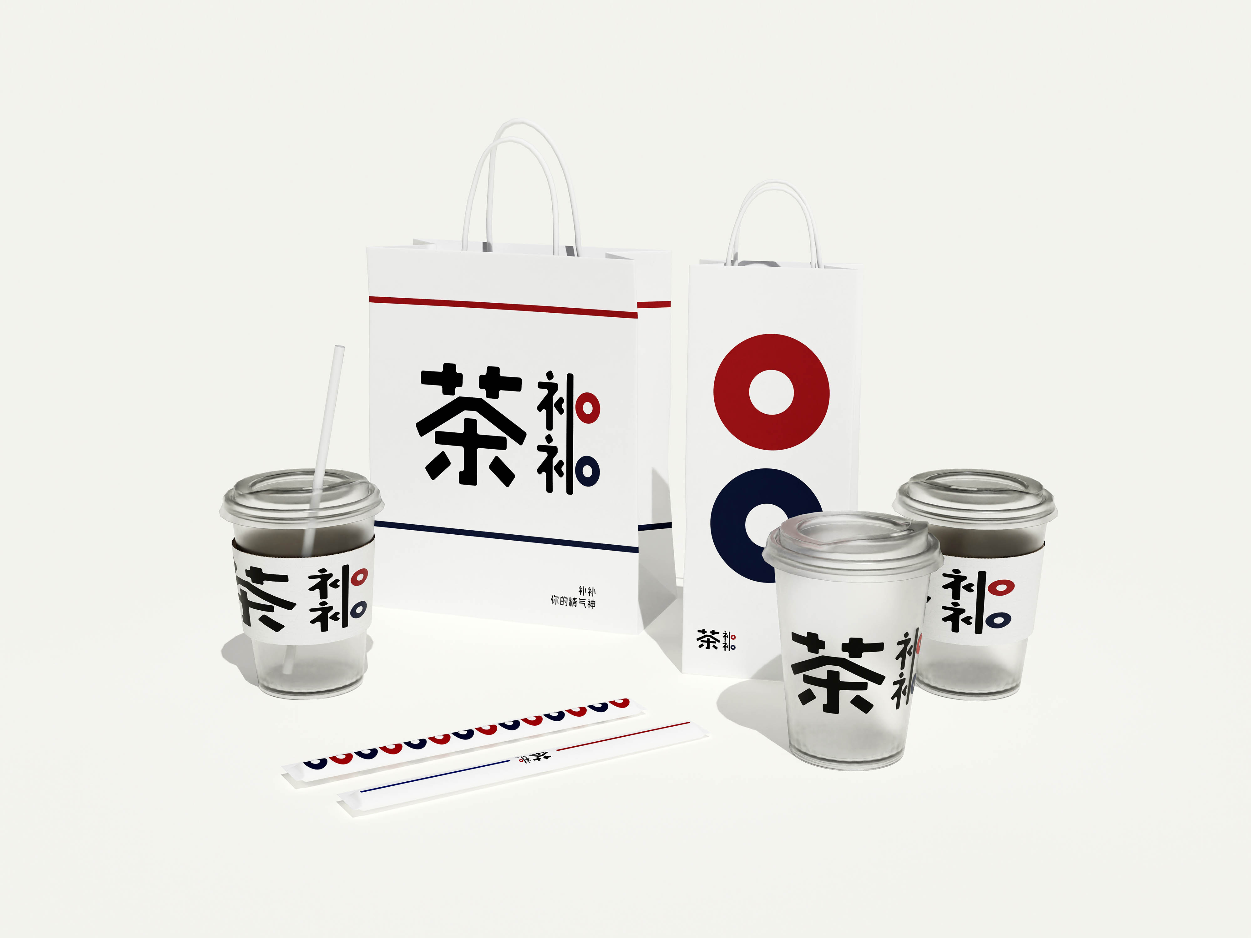
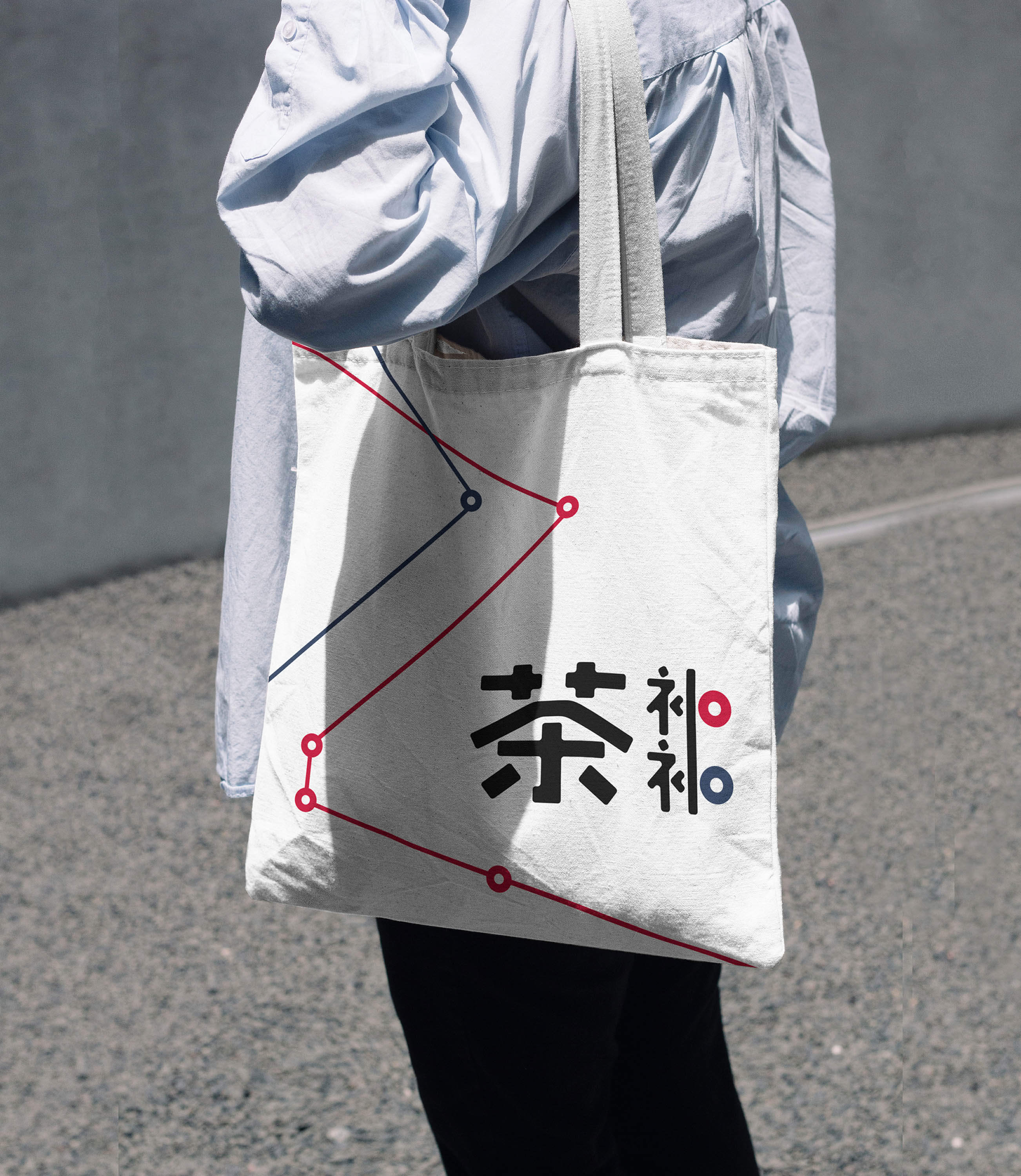
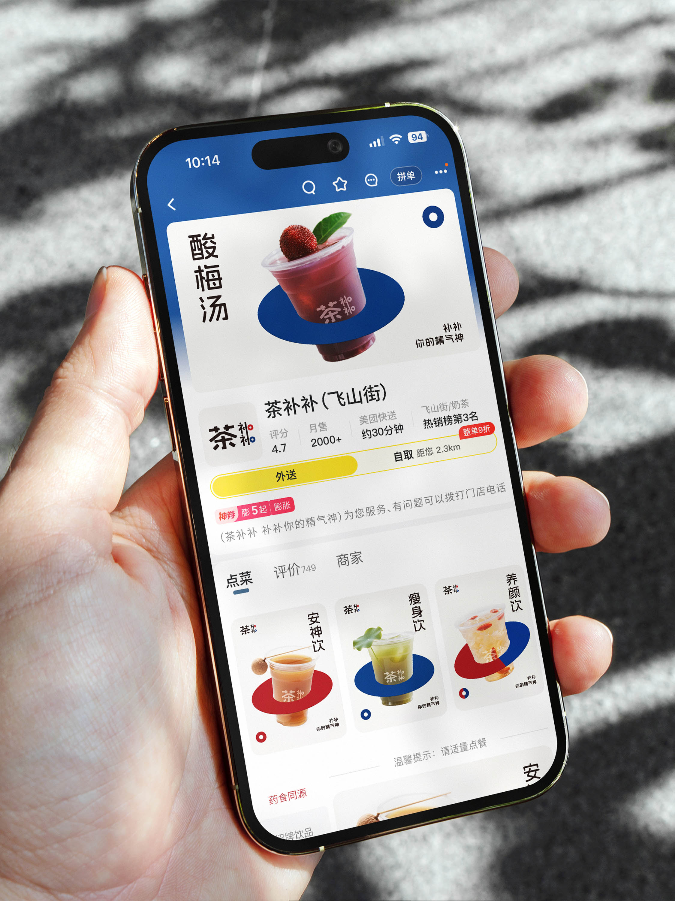
Cha Bubu is a modern tea beverage brand that thoughtfully weaves the wellness wisdom of Traditional Chinese Medicine (TCM) into contemporary lifestyles. By reimagining tea as a bridge between TCM traditions and modern life, Cha Bubu aims to make TCM culture more approachable and to promote holistic wellness concepts among younger generations.
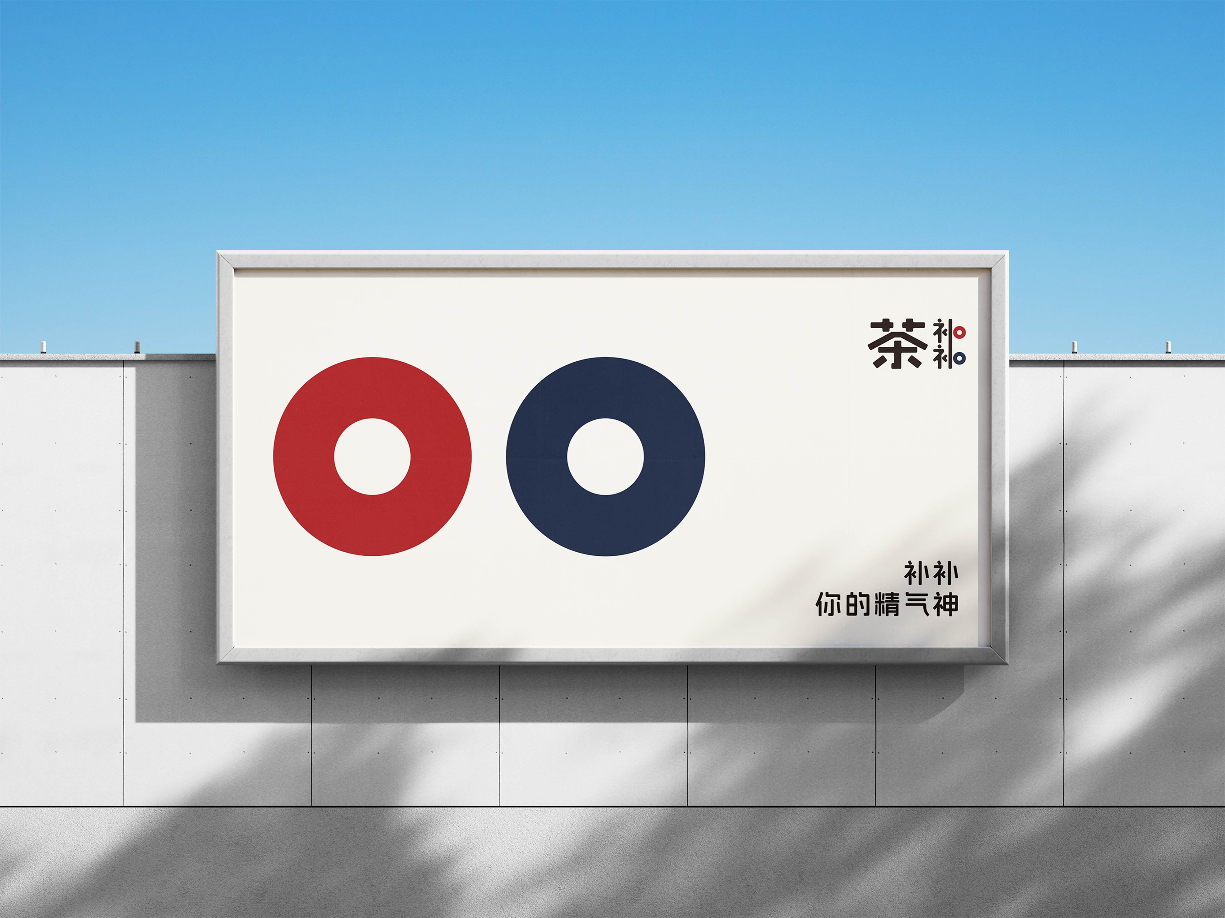
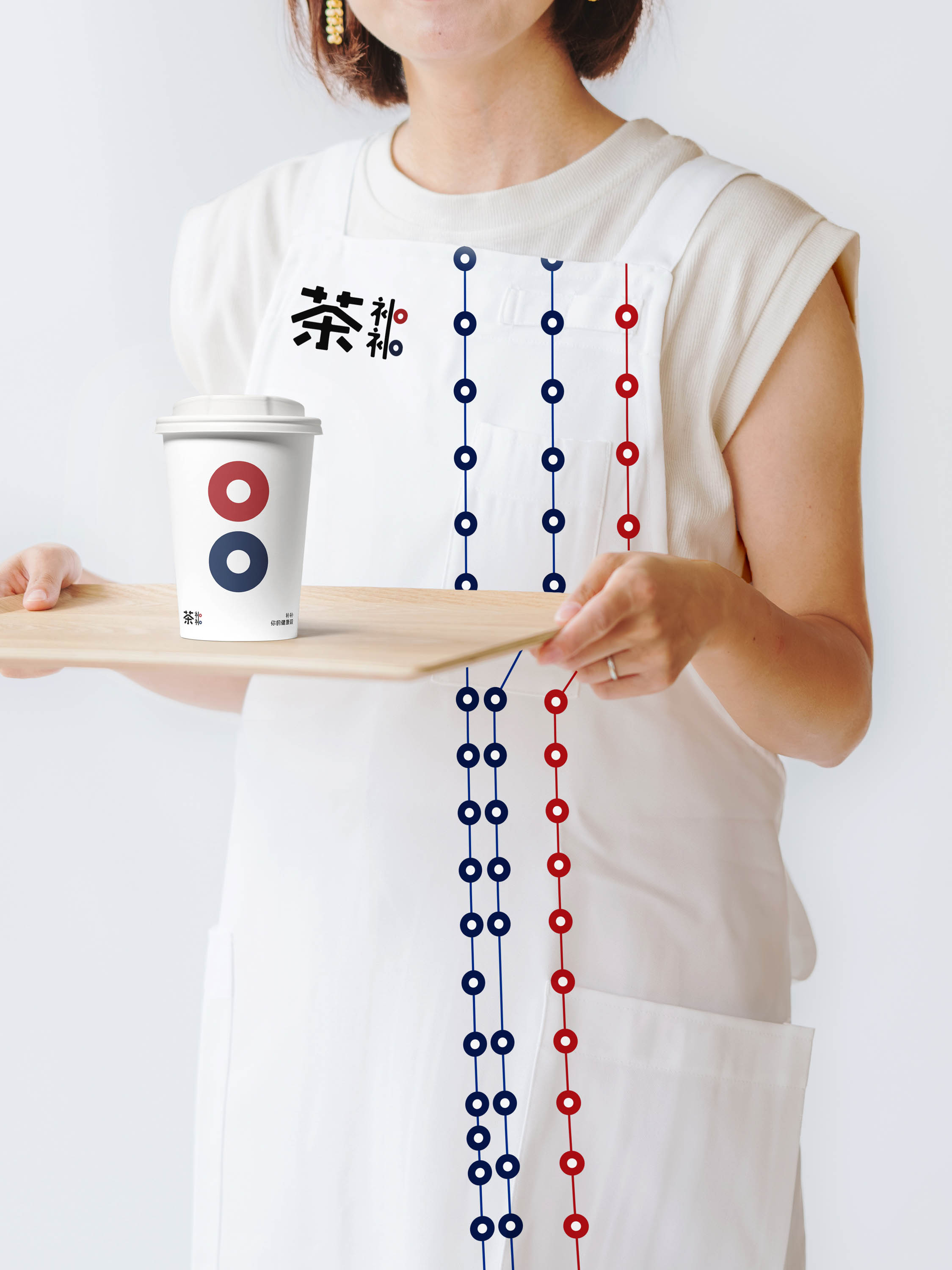
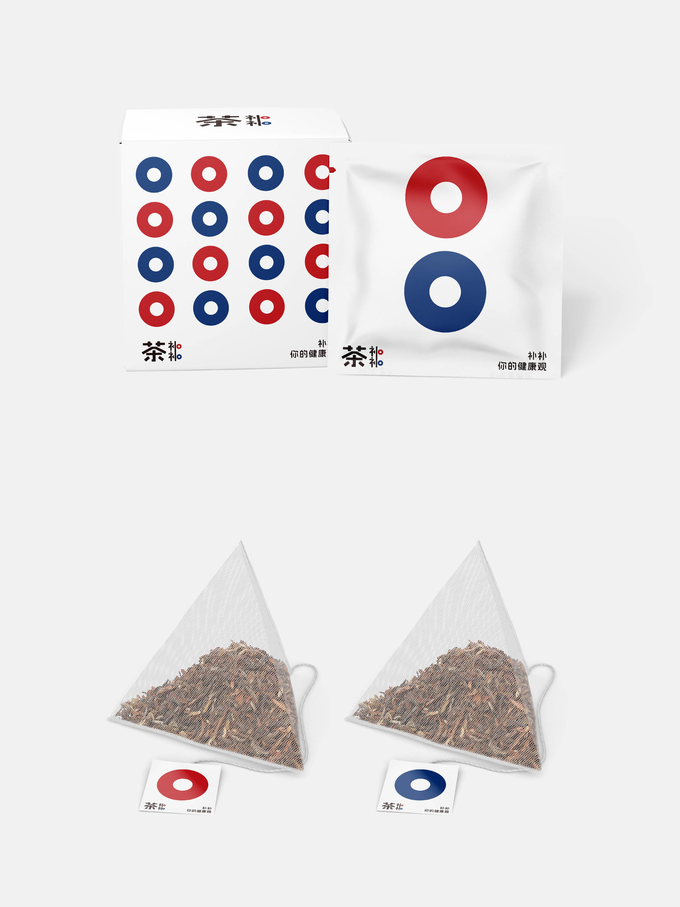
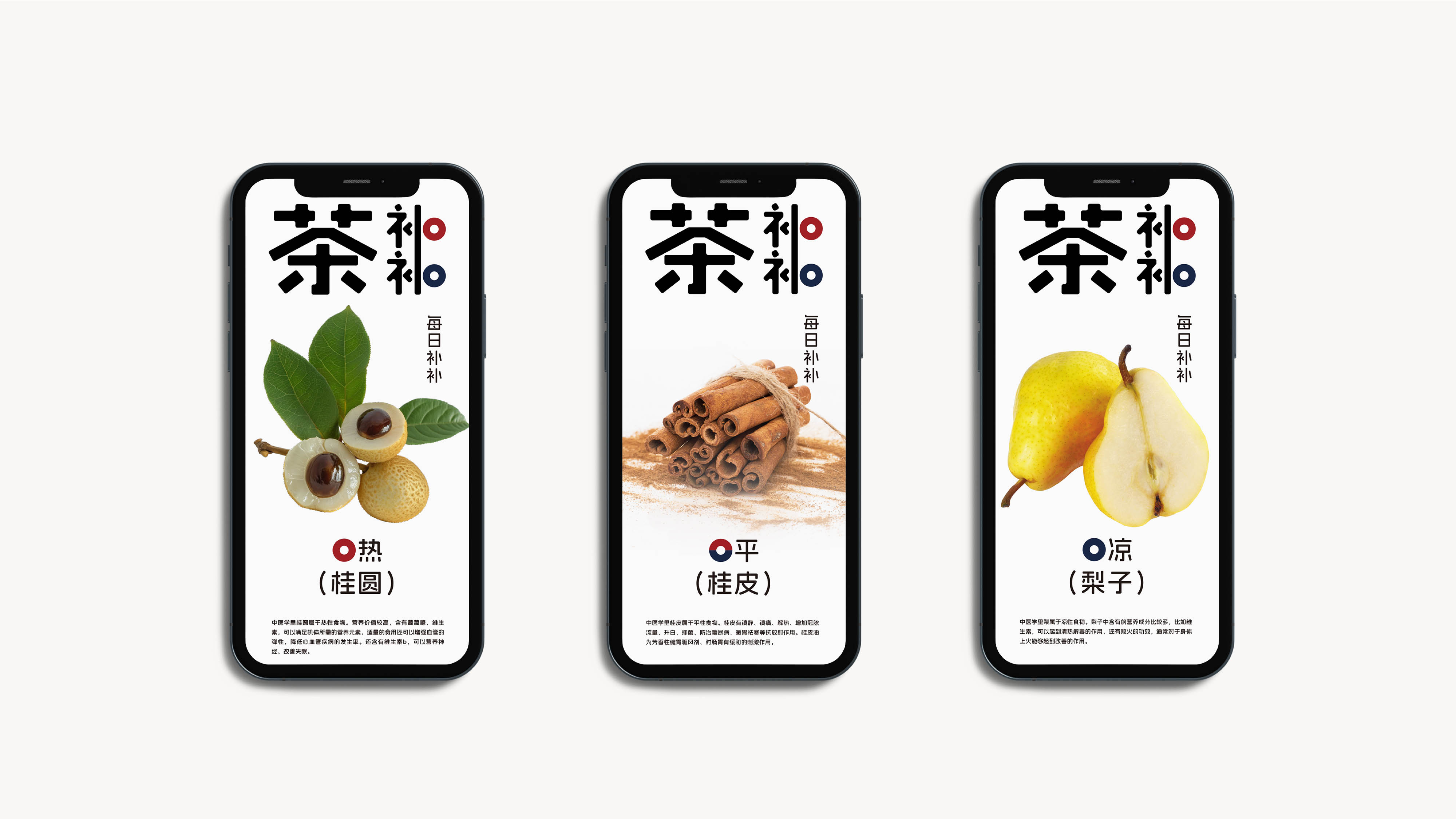
A systematic visual language transforms abstract TCM theories into intuitive, tangible visuals. The core emblem—a minimalist circle—is inspired by the idea that “Yin and Yang meridians interconnect like an endless cycle,” as described in Ming Dynasty physician Shizhen’s An Exposition on the Eight Extraordinary Vessels. This simple yet profound shape embodies core TCM principles—the circulation of Qi and blood and the harmony of Yin and Yang—while echoing the deeper Eastern belief that “the greatest truths are simple,” all infused with timeless Eastern aesthetics. The result is a distinctive brand identity rich in cultural depth and modern appeal.
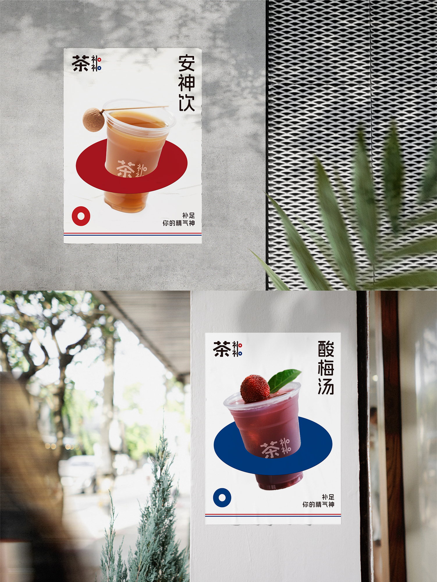
Color also plays a functional role. Guided by the TCM theory of the Five Elements—and five corresponding colors (green, red, yellow, white, and black), the color palette features five elemental hues: cyan, vermillion, ginger yellow, mica white, and sesame black. These colors do more than delight the eye; they also make it easier for consumers to distinguish between product types at a glance. Cyan and vermillion act as primary identifiers, signaling cool-natured and warm-natured tea beverages respectively for consumers to choose products aligned with their individual body constitution. Ginger yellow, mica white, and sesame black serve as secondary colors, enriching the visual system with subtle depth and balance. Together, they form a cohesive visual language that is both practical and culturally meaningful.
Credits